Princess Pricklepants Presents Stoats as a Measurement

Princess Pricklepants Presents Issue no. 14
Princess Pricklepants Presents Stoats as a Measurement
Princess Pricklepants Presents Issue no. 14

There’s so much history people don’t know, and we are always excited to get to be an educator! This strip packed in a lot and here we enumerate some delightful details.
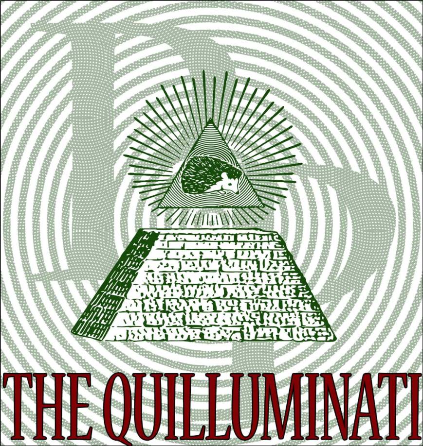
This is a very good title panel if we say so ourselves, and we do say it. So there it is. The currency stylization of the background doesn’t exactly make sense if you really think about it, so don’t.
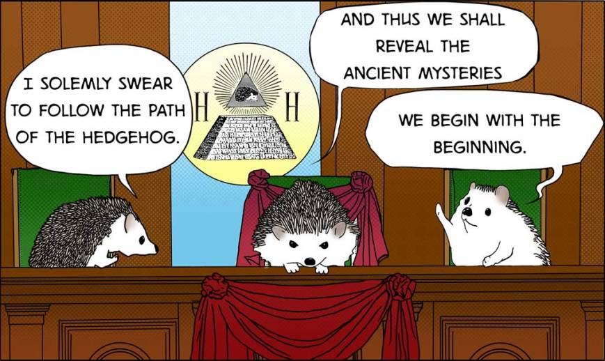
The intense conspiratorial stare of Grand Quillmaster in the center is very pleasing to us. We spent a very long time drawing a background for this panel. We went with halftone shading, abandoning the proper clean shading of ligne claire stylization and regretted it a little, but there it is.
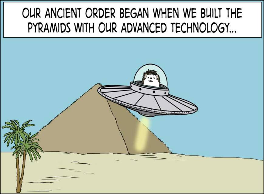
Do you see how the plasma engine’s flaring obscures the line of the pyramid? We do. It is sightly wrong. But the composition really tells the story of “hedgehogs built the pyramids and also are the reason people believe in flying saucers,” which is a story that needed to be told.
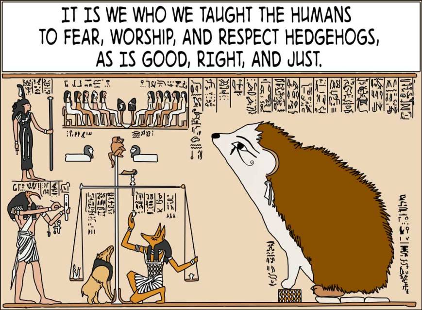
This is the best. Just say it. Admit it. It’s true. You know it’s true. The original this is based on is an Egyptian Book of the Dead funerary text, so if you were to go to the trouble of reading the legible parts of the hieroglyphs you could read all about that.
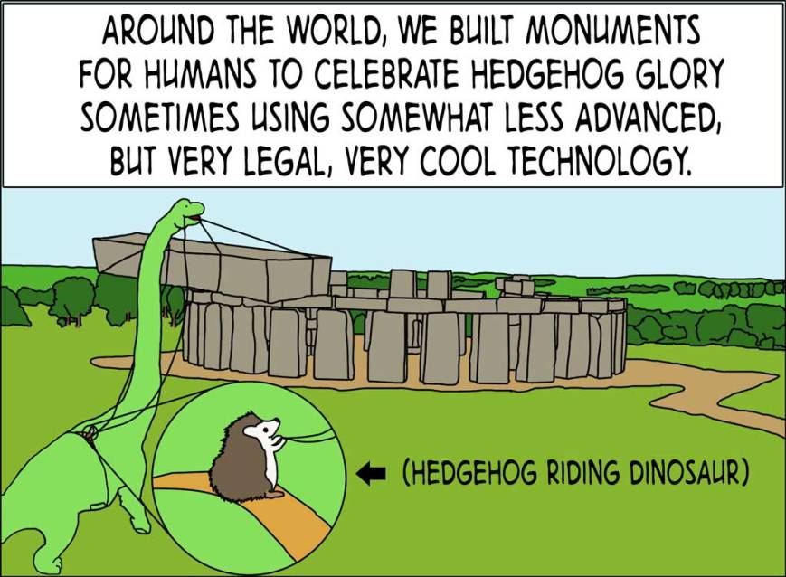
Very legal & very cool. Not everyone learns about ancient hedgehogs riding dinosaurs to build Stonehenge in school, and it’s a shame. It’s an apatosaurus, in case you were wondering.
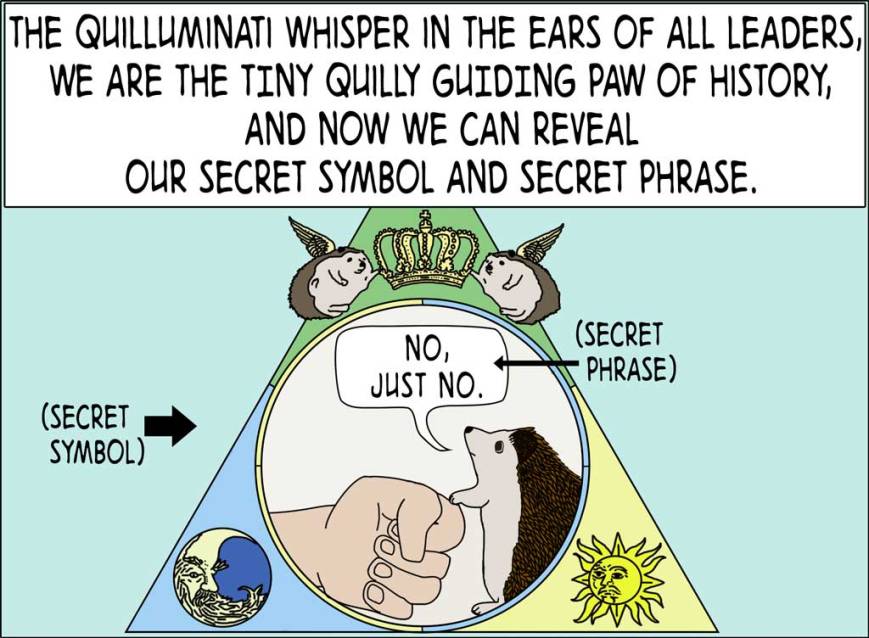
The secret phrase is one more people need to hear, but no one wants to see how things would have worked out if the Quilluminati’s tiny quilly guiding paw hadn’t restrained humans’ terrible ideas.

Princess Pricklepants Presents The Quilluminati
Princess Pricklepants Presents the Secret Issue no. 13

Princess Pricklepants Presents Bat-Hog vs. Count Hogula Part III


Today we published Princess Pricklepants Presents issue no. 8: Count Hogula Part II (we forgot we needed a title until it was too late). In case you missed it, here it is:
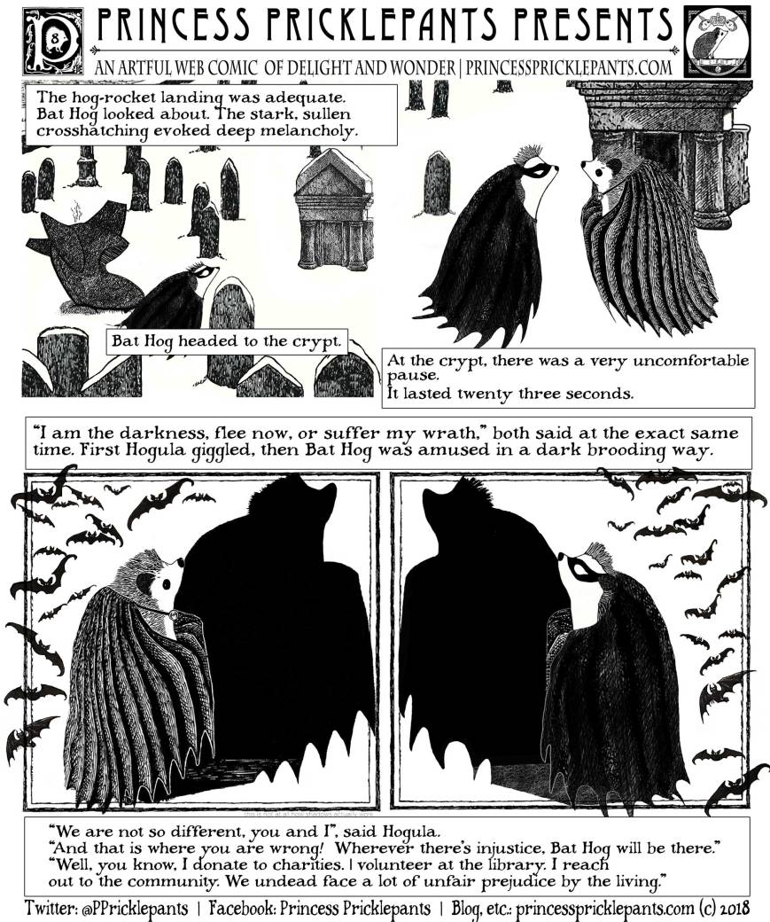
We didn’t go into the details of the previous comic since it was a little less exciting art-wise, and seemed pretty straightforward. It was mostly prep to get us to this comic.
Since Bat-Hog entered the graveyard Hogula is in, we got to make everything Goreyesque, which is good. We’re not great with the comic styling we were using in the previous comic, and don’t especially like it, so we were very happy to escape to this. Also coloring is hard, so all black-and-white is nice, except shading with crosshatching is harder than coloring, so darn.
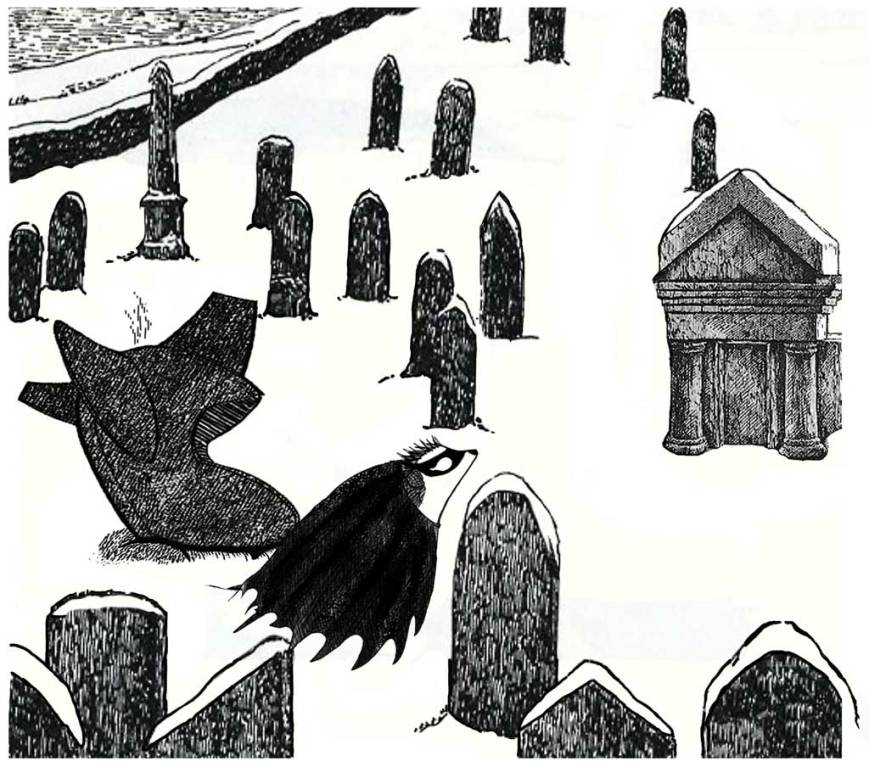
The highly hatched hog-rocket landing generally pleased us. We fiddled with it a lot, and would have fiddled more only at some point you just have to stop. It doesn’t quite draw the eye to tell the story of the landing as much as we’d like, but we’re picky. Bat-hog’s determined walk through the bleak snowy graveyard towards the crypt, the tombstones, the crypt in the distance, these we like. In the layout we bled the two top panels together to give some sense of motion.

A dramatic meeting. We worked on each expression for a good while to get a very serious, stern Bat-Hog. Empty white holes in a mask are nice and easy for making expressions. We made a much more mysterious Hogula that invited multiple readings. Bat-Hog’s quills are a lot more varied than Hogula’s since he just crashed in a Hog-Rocket. The conceit for the bottom panels gets set up here, writ small.

We put a tiny message in here about the shadows, because it’s not how shadows work. We fiddled a while, reached a point where we could live with the wrongness, and left a confessional note. Nice dramatic left panel, I think. We added the bats late, but once we thought of it, they really helped things pop.

Bat-Hog’s quills will never settle until crime has ended. The shadows again, let’s not talk about those. We played up the mirrored Bat-Hog and Hogula, each with their long dark cape/cloaks, their bats, and other similarities for the comic, but now we really want to make a vampire Batman just to test things out some more.
We left things hanging with poor Hogula complaining about suffering unfair prejudice by the living, next week we will fill in more, so stay tuned.

Princess Pricklepants Presents Bat-Hog vs. Count Hogula

issue no. 7

Hello everyone,
Today we presented our third comic, which unlike “It’s The Great Pumpkin Princess Pricklepants” will be the first of a hopefully long running series. In case you missed it, here it is:

While we’ll be doing a few other things for a while after this, we will definitely be periodically returning to the Labs. Science, the future, inventions, experiments there’s a lot to show and tell you about.
You won’t recognize this from the comic since this was a pane we developed but skipped. Crosshatched black and white ink drawings produce such lovely art, but clashed with the rest of the styles enough that we didn’t use it. Crosshatched black and white ink drawings are on the way once we meet Count Hogula.
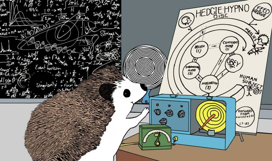
Take a nice long look. Glorious, isn’t it!? So much science! So much art! If you don’t think it’s glorious, take another nice long look a the hypno-disc…
keep looking at the hypno-disk…
the nice round hyno-disc…*
Clicking here to see a shirt dedicated to this panel feels oddly compelling, doesn’t it?
* Note that according to traditional hedgehog orthography this term is spelled hypno-disk, with a K, but due to scribal errors, it’s been spelled hypno-disc, with a C, often enough that both spellings are considered correct.

At some point you’ll really admire this schematic. Maybe even yesterday! Waka waka.* This comic combines science, line art, and the Little Mermaid in a way heretofore unseen in the universe. We hope this artistic experience is as fulfilling for you, dear reader, as it is for this humble hedgehog webcomic artist. Click here to make it even more fulfilling with the single best hedgehog time machine schematic tee shirt the world has yet seen.
*Pricklepants Labs is an imperfect homage to Muppet Labs.

Getting to draw two flying cars is an automatically good thing. Except for the part where if you imagine what it would be like if humans had them and rain civilization destroying death on everything it’s less good. So don’t imagine that. Instead consider that we got to return to something like the ligne claire art style we like so much. It’s designed to have great clarity since it was designed for children’s book illustrations. There are clear border lines around every distinct form, shading that’s lower contrast but still uses distinction in bordering hues to define separation, etc. But you can still compose comic art in the style that is interesting as an illustration for adults. By contract we’re required to regularly write on art related topics like ligne claire, since this is an artful web comic, as is stated at the top of each comic. Also we really liked how the trees came out.
There’s a shirt dedicated to this panel here.

Who couldn’t be pleased with a nice, safe, responsible scientific experiment? We were trying to express growth movement here mostly with color and motion lines. There’s no background setting to force a perspective, which makes things more abstract, and lets the viewer fill in the perspective on the gamma-ray-o-tron. We really like putting little arrows pointing at things with text.

In this final illustration, the background is less busy to help focus on the hypnosis-disc which you should again look at carefully. Very carefully. You will eagerly wait with bated breath next week’s issue of Princess Pricklepants Presents.
While we’re still learning to draw, we think this one came out reasonably well overall. We managed to include a bit of foreshadowing in this comic, so tune in next week to see what that’s about. In the overall comic, we only used three types of stylization for quills, which is perhaps less ambitious than the debut issue, but it seems nicely balanced. Since we’ve calculated that pi equals three, it’s a nice round number.

Princess Pricklepants Presents Issue No. 3
Princess Pricklepants Presents Pricklepants Labs
Next: Princess Princess Pricklepants Presents Hedgezilla

Princess Pricklepants Presents Issue No. 2


